Aligning pixels…
All Projects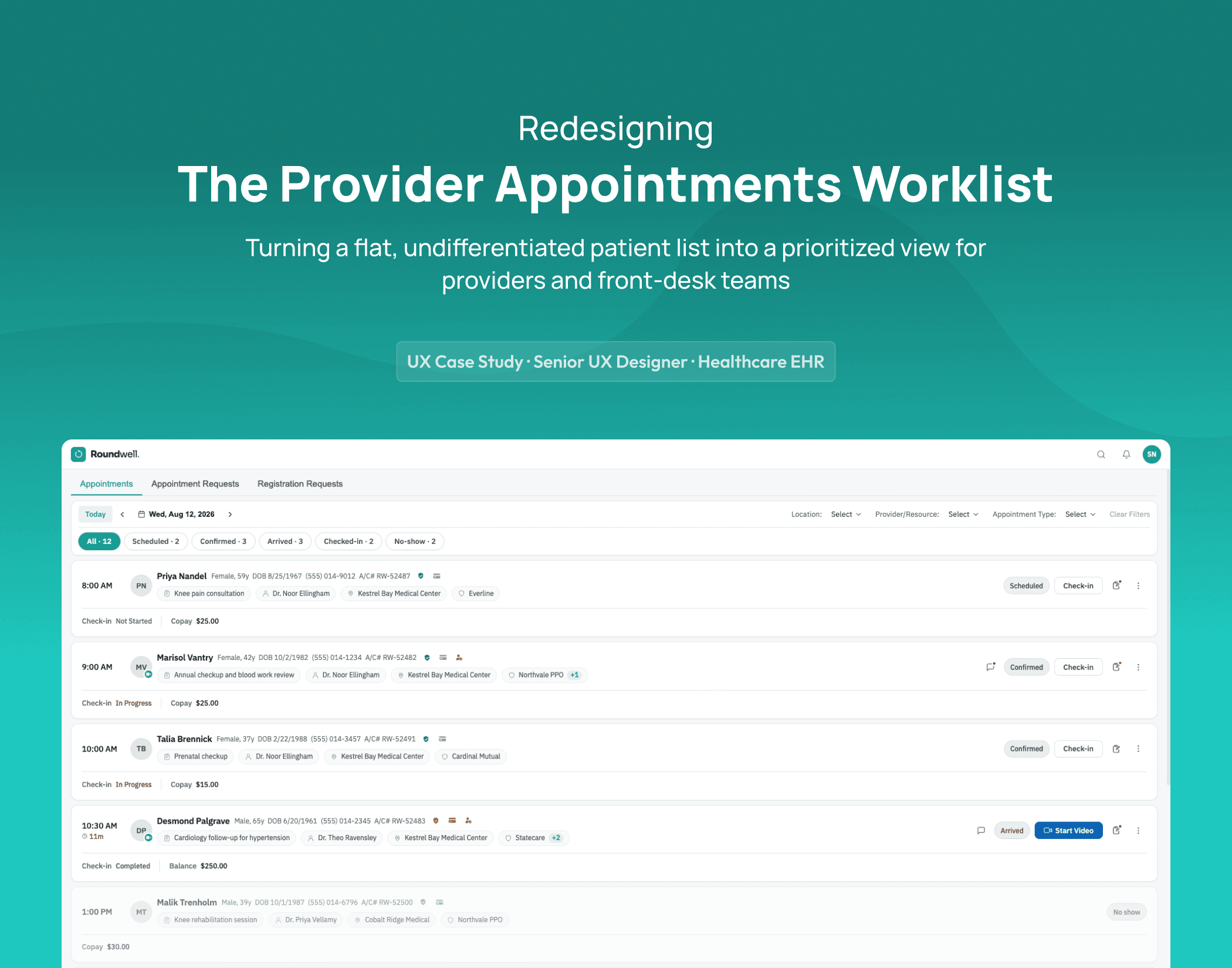
Enterprise · Healthcare · UX Case Study
Provider Appointments Worklist
Redesigning the Appointments Worklist for Providers & Front-Desk Teams
Role
Senior UX Designer
Scope
Owned complete information architecture, UX, and UI — end to end
Team
Business Analyst, VP of Product, Technical Product Manager
Domain
Healthcare EHR — Provider Scheduling & Front-Desk Operations
Year
2026
5
Live practices shipped to in beta
3
Connected modules redesigned together
More
Automation practices asked for next
This case study describes real work and real design decisions. Screens shown are recreated, rebranded mockups ("Roundwell") — not the actual product interface — to protect employer confidentiality. Patient and provider data shown is fictional.
The Problem
Every day, providers, front desk staff, and billing teams open one screen to get their bearings: who's on today's schedule, who's arrived, who needs a copay collected, who's about to start a televisit.
This screen is used constantly, by people juggling other tasks at the same time — it needs to answer "what do I need to act on right now" in seconds, not require a full scan of the day.
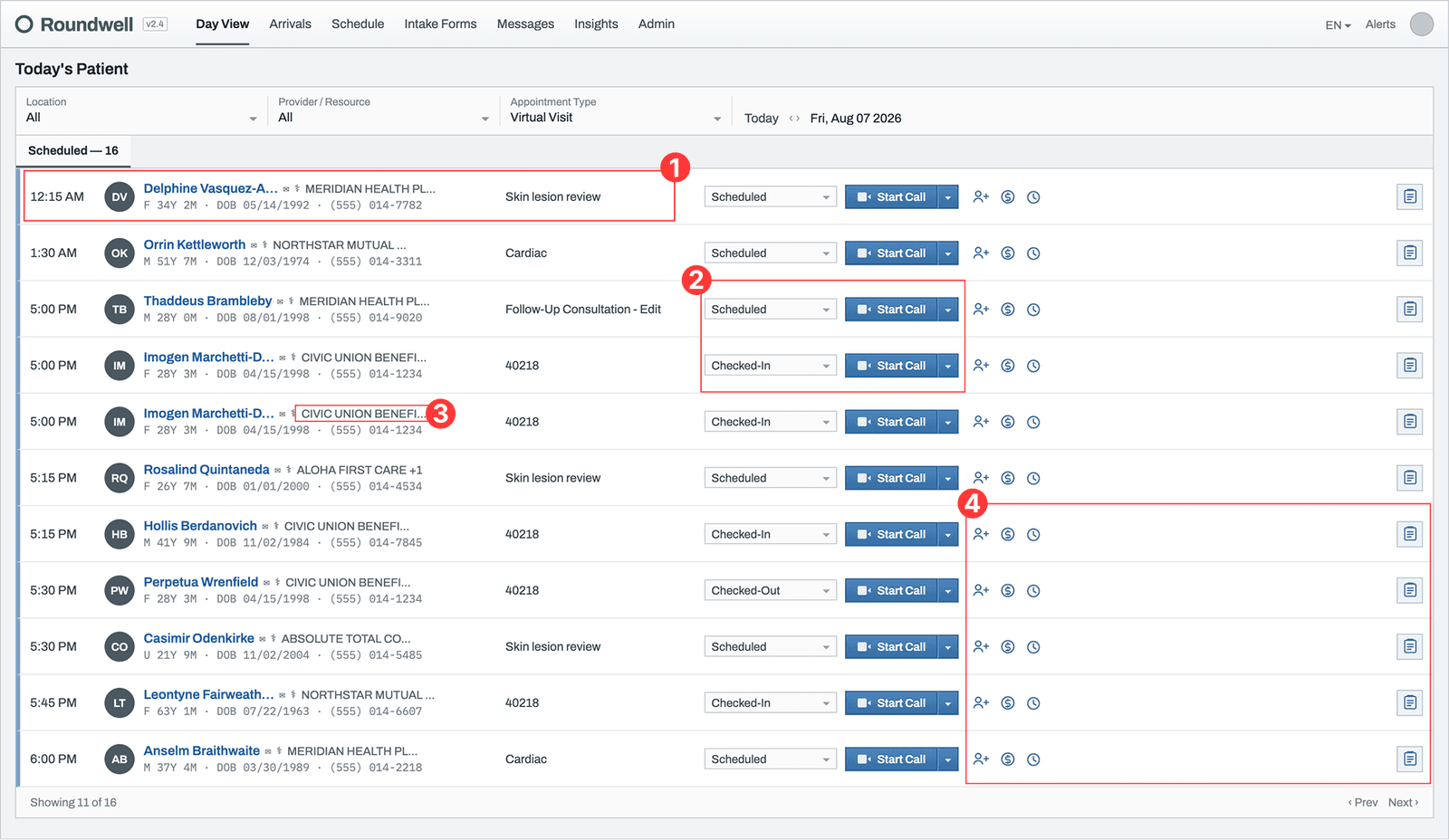
The previous version showed every scheduled patient in a single flat list, with no distinction between what needed attention now and what didn't. A visit from six hours ago and one starting in five minutes carried the same visual weight, the same fully-enabled "Start Call" button, the same everything.
Provider names and locations weren't shown at all — staff had to open a patient's record or apply a filter just to know who they were seeing or where. Insurance names were truncated mid-word with no way to see the full value or know if a second plan was on file. A handful of small icons sat at the end of every row with no labels, so their function had to be learned by trial and error.
01
No provider or location, anywhere on the row
Whether this was Dr. A or Dr. B, Main Hospital or a satellite clinic — you had to open the record to find out.
02
Every row looked equally urgent, because nothing distinguished urgency at all
The same enabled "Start Call" button appeared identically on a visit from hours ago and one about to start.
03
Insurance name cut off mid-word, no way to know if there was more than one plan on file
"MERIDIAN HEALTH PL…" — and no indication of what came after it, or whether a second payer existed.
04
Three unlabeled icons at the end of every row
No way to know what any of them did, or which patients actually needed that action, without clicking each one individually.
Before
After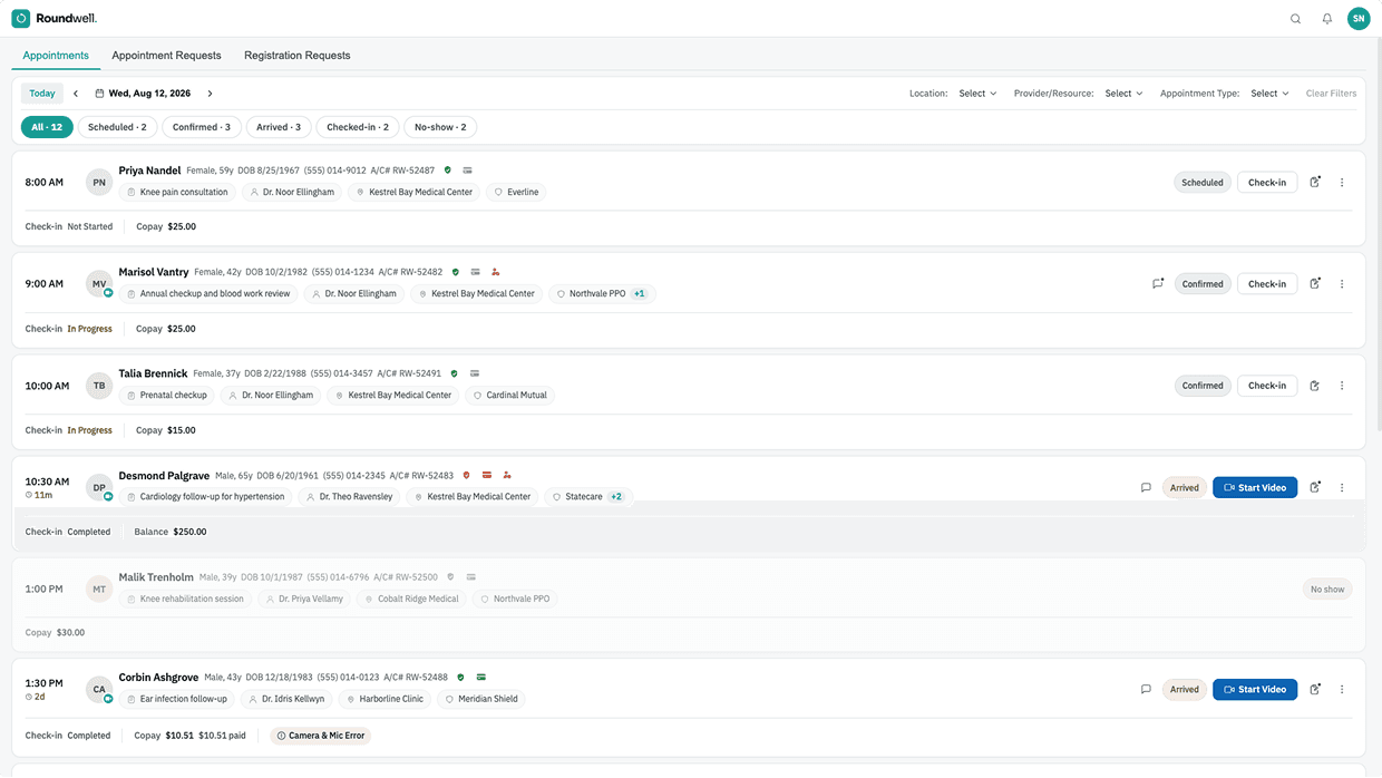
Research
01
This screen sits inside a larger system.
Today's Patient Appointments is one of three connected modules (alongside Appointment Requests and Registration Requests) that front desk staff, providers, and practice operations teams move between constantly throughout the day.
Appointment Requests is where new patient-initiated scheduling requests get reviewed, accepted, or rescheduled; once accepted, they land in Today's Patient on their scheduled date.
Registration Requests is where entirely new patients request to join a practice or specialty before ever being scheduled. This case study focuses specifically on Today's Patient, since that's where the redesign's core decisions are easiest to show in depth, but the same architecture and visual language were applied across all three.
02
The starting point was direct.
Users had repeatedly reported that information felt scattered across the screen, forcing slower decisions than the workflow could afford. Working with the team, an early direction modeled a dense, tabular, column-based layout — a familiar pattern closer to how established platforms like athenahealth structure their scheduling views.
It didn't hold up in practice: with this much data per patient (provider, location, insurance, eligibility, copay, status), a strict table became visually dense and broke down badly on smaller screens, where columns had nowhere to go.
That result directly shaped the move toward the current two-layer row structure — primary information in the main row, secondary context in a clearly grouped line beneath it — which held up at both desktop and smaller viewport widths.
The Key Insight
Surface what's needed at a glance — provider, location, copay, eligibility, appointment status — and keep what's occasionally needed one deliberate interaction away, never buried, never dumped all at once.
This is the same principle behind the eligibility verification redesign: nothing gets hidden, but the hierarchy matches how the decision actually gets made in the moment.
Design Decisions
01
Provider and location, visible on every row
No more opening a record to answer "who's seeing this patient, and where." Both sit directly under the visit reason, at a glance.
02
A two-axis status system instead of one ambiguous dropdown
Appointment status (Scheduled / Confirmed / Arrived / No-show) and check-in progress (Not Started / In Progress / Completed) are shown separately and color-coded, so staff can read a patient's actual state without interpreting a single overloaded label.
03


Color-coded status icons with explicit tooltips, applied consistently across three different signals
Insurance eligibility, card status, and recent record changes each use the same green/red/grey (plus orange for "expiring soon") color logic, with a tooltip naming exactly what changed or what state applies. One consistent visual language, reused deliberately rather than inventing a new pattern for each signal.
04
Copay and balance shown upfront, not hidden behind a hover or click
The exact amount due sits directly under each row, every time — removing a discovery step that used to sit between staff and information they needed constantly.
05
Televisit state is visually distinct, not uniform
A patient who has arrived gets a solid, prominent "Start Video" button, visually different from the outlined "Check-in" action shown for patients who haven't arrived yet, so staff can tell "ready to join now" from "not yet time" without reading each row closely.
06
Filters split by actual usage frequency
The filters used constantly — appointment/check-in status — became one-click chips with live counts (Scheduled · 2, Confirmed · 3, Arrived · 3…). Filters used occasionally — location, provider, appointment type — stayed as dropdowns. This mirrors the same "surface what's frequent, tuck what's occasional" principle applied to insurance: the primary plan is visible by default, secondary plans appear in a tooltip rather than being hidden entirely or cluttering the row.
Discarded Direction
The first version of this redesign used a dense, table-style layout — a fixed header row with a column for each data point, closer to the structure used by established platforms like athenahealth.
It looked organized on paper, but broke down in practice: with this many attributes per patient (provider, location, insurance, eligibility, card status, copay, appointment status, check-in status), a strict column table became visually overwhelming, and it didn't hold up at all on smaller screen widths — there was nowhere for the columns to go.
That constraint pushed the design toward the current structure instead: a primary row carrying the most time-critical information, with a clearly grouped secondary line beneath it for supporting detail. The eventual design keeps the same "everything important, clearly grouped" goal the table version was reaching for, without the rigidity that broke it.
Collaboration
This wasn't a solo design exercise, and the team's input shaped it in distinct ways.
01
The Technical Product Manager
closest to how the existing system was actually being used day to day, grounded decisions in real usage patterns and what was realistically buildable.
02
The VP of Product,
the most experienced voice on the project, guided the final direction on the harder calls, including the move away from the initial table-based layout.
03
The Business Analyst
helped translate practice workflow needs into concrete requirements. I owned the end-to-end information architecture, UX, and UI decisions throughout.
Outcomes
This wasn't validated internally and left there — all three modules shipped together as a live beta to 5 practices.
Feedback on the management and staff-facing side (the appointments view this case study focuses on) was positive across all five: practices reported the redesign made day-to-day scheduling decisions easier to manage.
The strongest signal came from what practices asked for next: several requested more automation on the patient-facing side of the system — appointment and registration requests — specifically to reduce manual review and the errors that come with it.
That's a meaningful validation in its own right: practices weren't just satisfied with what shipped, they wanted the same underlying clarity extended further into the workflow, which speaks to the redesign solving a real, felt problem rather than a cosmetic one.
Reflection
Reaching this design took a real, incremental process — a first attempt modeled on a familiar, established pattern (a dense table layout close to what athenahealth uses) that looked right on paper but broke down under real data density and real screen constraints.
Letting go of that pattern, rather than forcing it to work, led to a structure that actually held up. Surface what's needed at a glance, group what's secondary clearly instead of hiding or dumping it, and let the real constraints of the data — not the most familiar layout — decide the structure.
Shipping this to five live practices and hearing them ask for more of the same clarity elsewhere in the workflow is the clearest evidence that principle held up outside of a design file.