Aligning pixels…
All Projects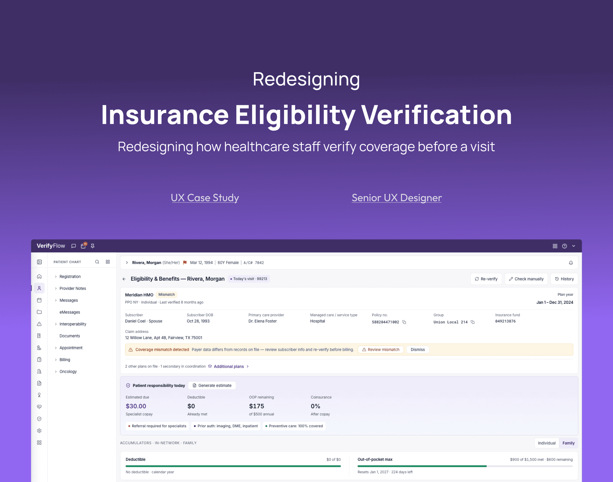
Enterprise · Healthcare · UX Case Study
Healthcare Eligibility Verification
Insurance Eligibility UX for EHR/RCM Teams
Role
Senior UX Designer
Team
Product Owner, Billing BA, Customer Success Manager, RCM Specialist, CEO (feedback)
Domain
Healthcare EHR — Revenue Cycle Management
Year
2026
Faster
Resolution at the point of care
Fewer
Interpretation errors on flat-list scans
Flagship
UX improvement cited by the CEO
This case study describes real work and real design decisions. Screens shown are recreated, generalized mockups — not the actual product interface — to protect employer confidentiality. Patient data shown is placeholder/fictional.
The Problem
Before a patient's visit, front desk staff, billing team members, RCM specialists, and FDOs need to answer one question fast: is this patient covered for today's visit, and what will it cost them?
The system answers this through a standard HIPAA-mandated insurance transaction (a 270 eligibility inquiry, answered by a 271 response) that returns everything the payer knows about a patient's coverage — active/inactive status, every benefit category, annual limits, family vs. individual breakdowns, and more.
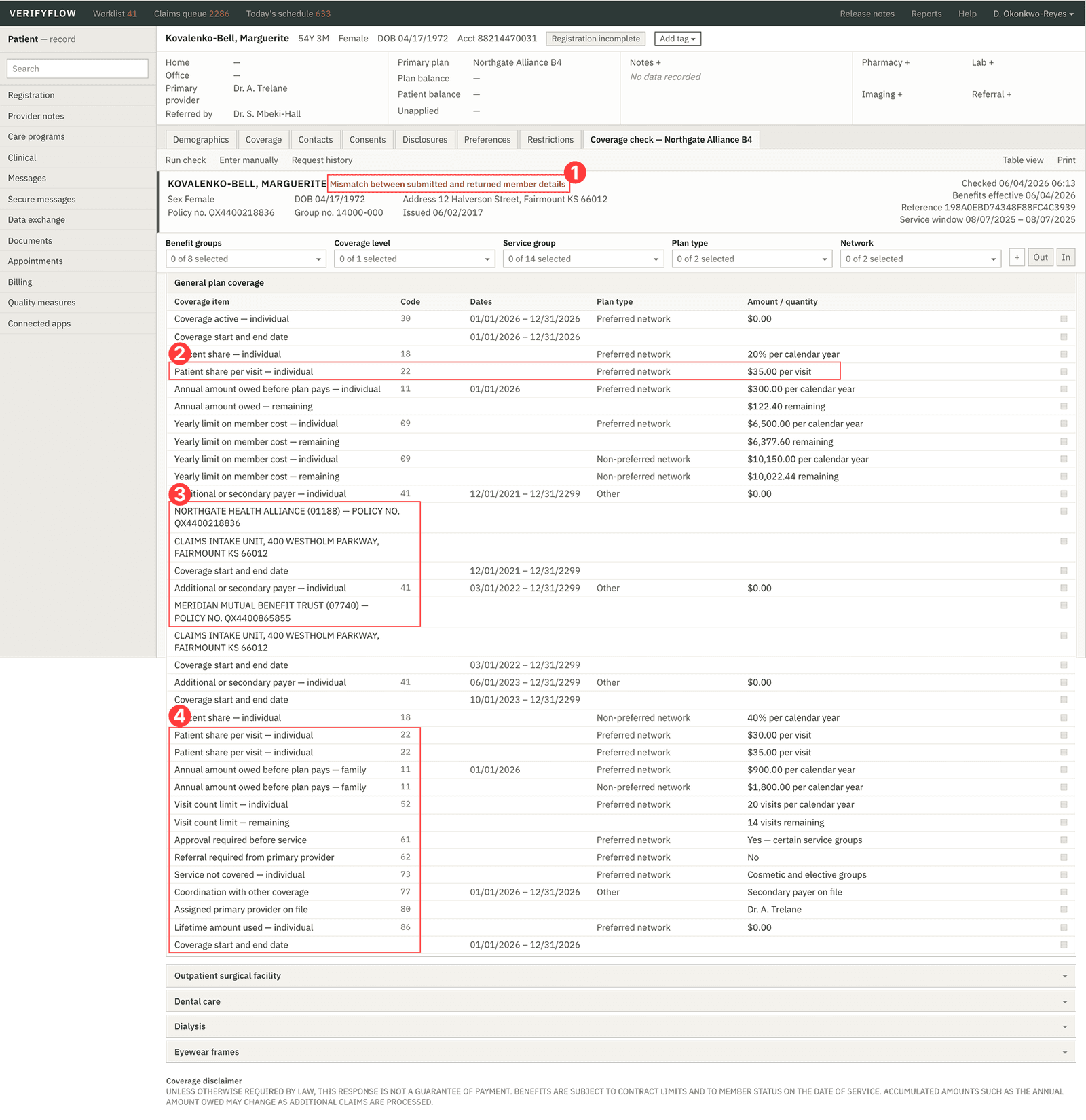
In the previous version of the platform, this full response was surfaced largely as-is: a long, undifferentiated list of benefits with no hierarchy. Every eligibility check required staff to manually scan the entire response to find the two or three data points that actually mattered for today's appointment. This made the screen slow to use, hard to train new staff on, and easy to misread under time pressure — a real risk in a workflow tied directly to billing accuracy.
01
The most important flag on the page looks like everything else
This is the one thing that should stop someone in their tracks — and it reads like a footnote.
02
Today's actual cost is buried in row 5 of 30+
This is the number the front desk actually needs right now. It's treated the same as an intake unit's mailing address three rows down.
03
Two payers, tangled into one list
Two different insurance payers, mixed into one table with no separation. You have to track which row belongs to who as you scroll.
04
The stuff a provider actually cares about is at the bottom
Everything specific to this provider's specialty — referrals, visit limits, primary care benefits — shows up last, after all the generic noise.
Before
After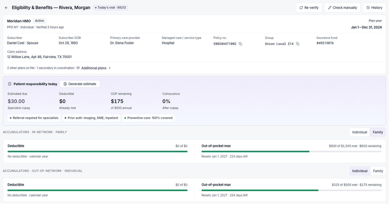
Research
To redesign this, I needed to understand two things: what the data actually contains, and what a person checking it actually needs at that moment.
01
Studied the underlying data standard.
The response is a 271 Eligibility Benefit Response, the HIPAA-standard reply to a 270 inquiry. It can include dozens of benefit categories, active/inactive/mismatch-type states, and coordination-of-benefits complexity (e.g., a patient with both medical and pharmacy payers) — most of which is irrelevant to any single visit.
02
Benchmarked competitor EHR platforms.
Looked at how established platforms (Epic, athenahealth-style workflows) handle eligibility surfacing — the consistent pattern was reducing the front-desk workload by pre-filtering and automating rather than exposing the raw payer response.
03
Talked to the people who use the screen daily.
Worked directly with the Billing BA/Product Owner, Customer Success Manager, and an RCM specialist to understand which specific data points actually drive their decisions during a visit, and which are rarely-needed edge cases (e.g., ambulance benefits) that only matter situationally.
The Key Insight
The response contains everything — but the person checking it only needs what's relevant to today's specific visit and provider specialty. Everything else is noise until proven otherwise. The redesign is fundamentally an exercise in progressive disclosure, not data reduction — nothing is hidden, but the hierarchy matches how the decision actually gets made.
Design Decisions
The redesigned flow surfaces information in priority order:
01
Patient and insurance details, today's visit, and annual limits — the full financial picture upfront
Patient name, payer, and verification status sit at the top so staff know who and what they're looking at immediately. Right below it: today's visit eligibility, copay, deductible, and coinsurance — the actual answer to "can this patient be seen, and what will it cost?" Annual deductible and out-of-pocket progress follow directly after, broken out clearly by individual vs. family/group coverage, so there's no ambiguity about which number applies to this specific patient.
02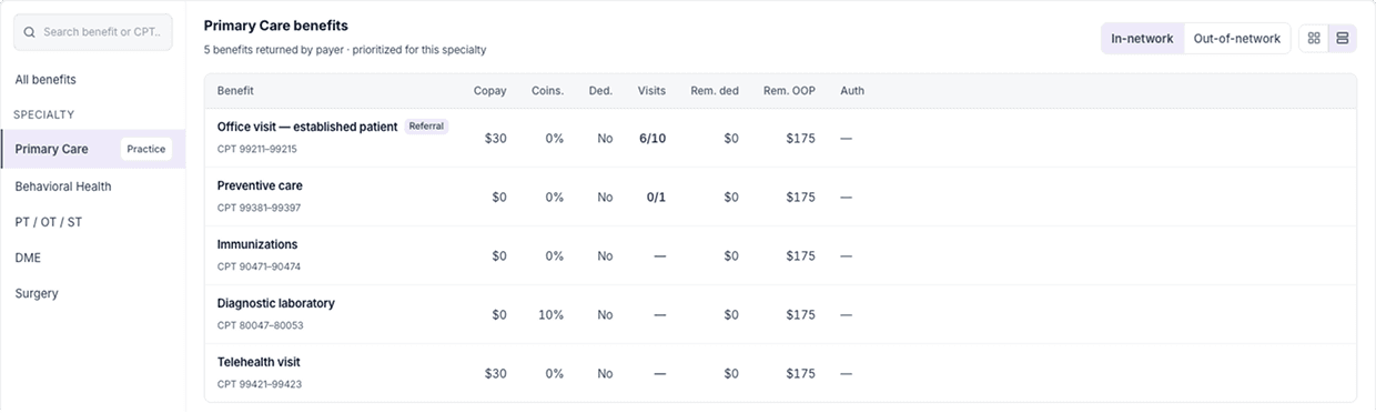

Specialty-filtered benefits, with per-benefit detail and an AI cost estimate built in
The response is re-aligned to the provider's practice specialty, so a primary care visit surfaces primary-care-relevant benefits first instead of an undifferentiated list. Each benefit expands to show copay, coinsurance, deductible, visit limits, and remaining amounts at a glance. A CPT-aware cost estimate sits directly alongside this view, clearly labeled as non-guaranteed, so staff get a quick number without leaving the screen — with a link to the standalone calculator when they need an exact figure.
03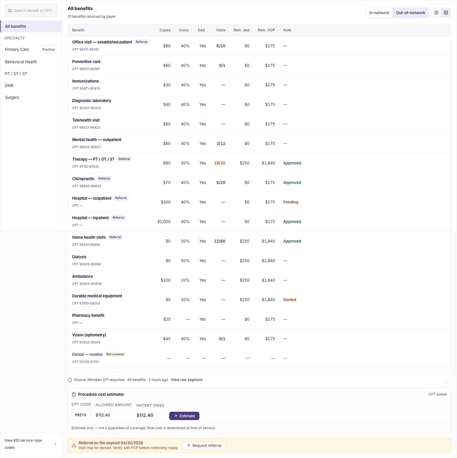
Full raw response, available on demand
Nothing is hidden — a complete, unfiltered benefits list (all 20+ categories a payer might return) stays one click away, so lower-frequency items like ambulance or DME coverage can still be checked when a visit actually calls for it.
04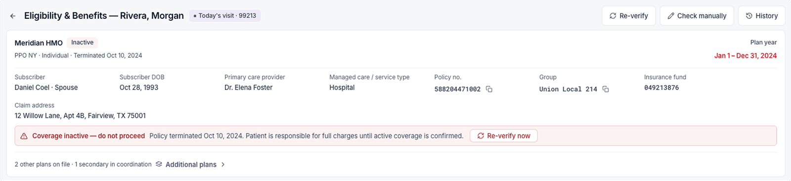
Designed for the messy real-world cases, not just the happy path
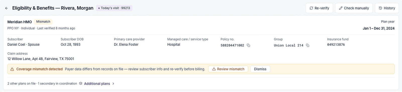
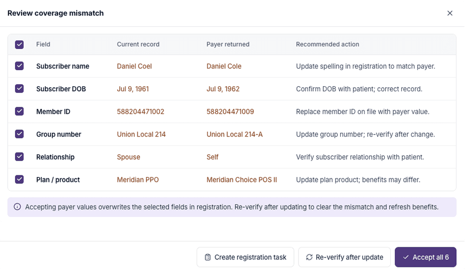
Coverage isn't always clean. The design accounts for mismatched patient data (submitted info doesn't match what the payer has on file) and terminated/inactive coverage — surfacing both clearly instead of silently showing stale data. For mismatches specifically, a side-by-side comparison shows exactly which fields differ between what was submitted and what the payer returned, with a recommended fix for each, so staff aren't left guessing what to correct.
Collaboration
This wasn't a solo design exercise. The information hierarchy and specialty-filtering logic were shaped directly by feedback from the Billing BA/Product Owner (data priorities), the Customer Success Manager (real support pain points), and an RCM specialist (day-to-day workflow needs) — with final sign-off feedback from the CEO.
Outcomes
Faster resolution at the point of care: staff no longer need to scan a full response to answer "what does this visit cost."
Reduced training burden: new hires can read the redesigned screen without dedicated training on how to interpret raw payer responses, a real shift from the previous version.
Fewer interpretation errors: the previous flat-list format made it easy to miss or misread the specific benefit relevant to a visit; the prioritized hierarchy reduces that risk.
Direct stakeholder feedback: RCM and Customer Success team members described the redesigned response as significantly easier to use and understand than the prior version. The CEO cited it as a flagship UX improvement for the product.
Reflection
This project reinforced that in regulated, high-stakes domains like healthcare billing, good UX isn't about simplifying data — it's about understanding the underlying data standard well enough to know what to prioritize, and designing disclosure order around the real decision being made, not just the visual layout of the screen.